So, you've been tasked with restructuring your object model. After hours of thinking through the implications of each design decision, you've sketched up your new object model in a UML class diagram. You're ready to present it to your peers! Now, how are you going to sell them on it?
Take a look at these two diagrams. Based on your initial impression, which one seems like the better design?

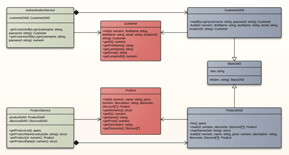
Even though they both present the same model, most people would have the impression that the second diagram is a better design.
UML is Visual
Many programmers are scientific, mathematical thinkers. Sure, there are some fabulous programmers who are also outstanding artists – I know some. For many programmers, though, it just doesn't come naturally. You've probably used an app that you just knew had a programmer-designed user interface, for example.
That can hurt us when it comes to presenting class diagrams. UML is a visual medium. If you want to sell someone on your new class diagram, you're gonna need a couple of things:
- Quality content. If you haven't actually produced a solid design, I can't help you.
- Quality presentation. While we're not all going to be artists, we still need to put effort into making our diagrams look good and read easily.
Tips for Class Diagrams
So, here are a few tips for making your UML class diagrams easier on the eyes.
- Avoid intersecting association lines as much as possible. If your lines have to cross, reconsider your design of the associated classes. Sometimes it means you've got dependencies where there shouldn't be. On the other hand, it could mean that you've got some core class that's simply common across the board. (Imagine, for example, if you were to include a String or Integer class on your diagram – tons of your classes would point to them!)
- Elide any details that aren't relevant. See my previous article, Speak to Me, UML! for more information.
- If you're diagramming across logical layers, choose a direction to represent those layers, and stick with it. For example, classes related to the presentation layer could be on the left, classes for your service layer could go in the middle, and your domain classes could go on the right. That way your UML tells a story from left to right, which is easy for your readers to follow (if their native language is written left to right, anyway).
- Use colors in your diagram to introduce distinctions between your classes. For example, classes in the same logical layer can have the same color. Don't just pick your colors willy-nilly, though. Consider using an online tool such as Kuler to pick a set of colors that go well together!
- Finally, if the page is too crowded, you might want to split your diagram up into multiple diagrams. It's much easier to process information in smaller chunks. If you put too much on a single diagram, your readers will feel overwhelmed, or they'll get the impression that your solution is too complex.
Naturally, the most important thing is to have produced a quality design. Good presentation can't make up for bad content. Still, you've gotta make a good impression. Since UML is a visual medium, give your class diagram the visual treatment it deserves!

No comments:
Post a Comment